Background
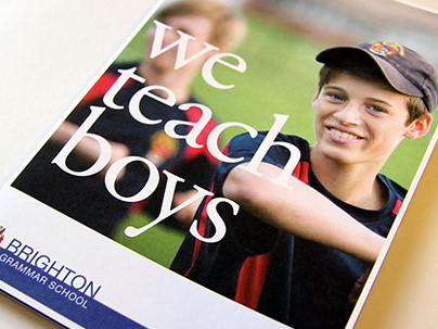
Founded in 1882, Brighton Grammar School (BGS) is an Anglican school for boys with approximately 1270 students, based in the suburb of Brighton in the south east of Melbourne, Australia. The Grammarian is the School's yearbook, produced annually as a keep sake for students/parents and members of the greater BGS community. It also provides a valuable easy to access history record for the School's archives. BGS required a yearbook that showcases the School in the best light, and engaged the audience more than the previous editions which were simple perfect bound gloss magazines.
Solution
The project began with researching other School Yearbooks. The majority were gloss magazines and heavily templated with a limited variety of designs on each page. A hard cover was suggested, section sewn for quality and strength/durability. The dimensions were moved from A4 to 30cm x 30cm, providing more visual real estate to showcase the brilliant content featured throughout.
Previous editions had a lack of white space, and typography set it 8 point which became very difficult for users to read. Group photos were cut off below the knees. We realised that the page count of the yearbook had to increase significantly from 224PP to 324PP. This allowed us to increase the white space used throughout the book, allowing the text and photography/illustrations visual space to breathe.
Previous editions had a lack of white space, and typography set it 8 point which became very difficult for users to read. Group photos were cut off below the knees. We realised that the page count of the yearbook had to increase significantly from 224PP to 324PP. This allowed us to increase the white space used throughout the book, allowing the text and photography/illustrations visual space to breathe.
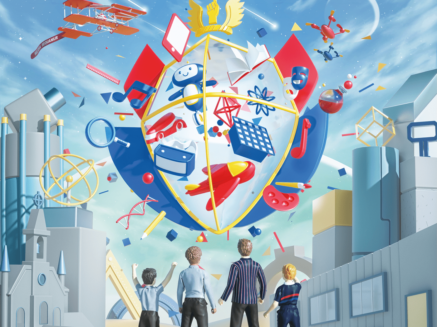
An illustrator (Ben Sanders) was commissioned to provide a visual theme for the Yearbook. 2014 was a year of change for the school with a new Strategy and a New Headmaster. Working closely with Ben, a theme relating to space was created that showcased the Headmaster at the front of a stylised paper plane "rocket", shooting into space. The illustration featured over the entire french fold dust jacket, which folded from the 30cm 30cm size of the book, to over A1 size (900mm x 650mm). To add value to the students in the School, a poster was created on the reverse of the dust jacket that had photos of the 1265 boys from 2014, continuing the space theme throughout the publication.
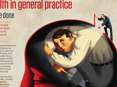
Using the new BGS visual style guide that we have been working closely with the School on, the contents of the yearbook were then fleshed out. As the book was very large, we divided the book into 10 sections that acted as section headers. Ben created the illustrations for these headers that related closely to the contents in each section.
High resolution photography and custom written content was laid out using a flexible grid system. The book was laid out using this grid, flexible enough to allow each page to look different and keep the audience engaged. Adding head shots of 1265 boys and over 200 staff to the Roll call was a challenge. We created a custom Java Script that automated the process, creating significant time and cost savings for the School.
Results
The Grammarian 2014 became a valuable keepsake for the School. It is an example of how improved design and production added value to the BGS community, engaged the boys, staff and parents and ensured the Grammarian will be used as a historical resource for years to come.
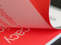
Above: The yearbook is covered with a custom PVC bellyband that features the title of the book. This allows the illustration on the dust jacket to be used as an A1 poster (folding out) and adds an extra dimension to the book.
The dust jacket illustration by Ben Sanders, symbolising the new Headmaster, Staff and boys of all ages on the paper plane rocket, "reaching for the stars".
Above: Section sewn binding is the strongest binding for books, ensuring everlasting durability and allowing the pages to open up relatively flat compared to a perfect bound book.
Above: Illustrations by Ben Sanders distinguished each section. The 324 page book required an easy to use system to allow easier navigation for users.
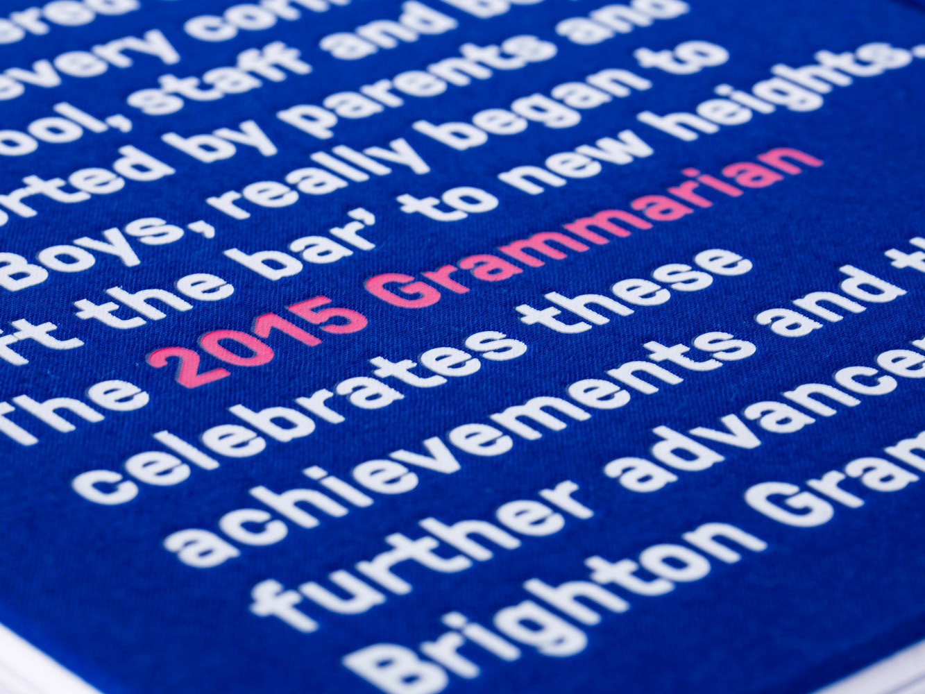
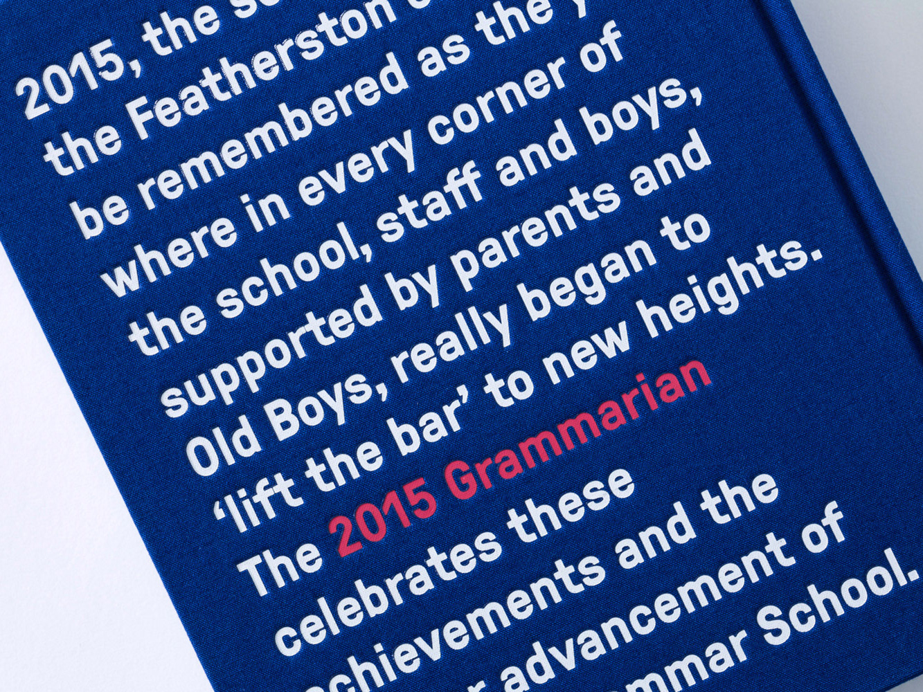
Above: The hard case cover is bound in a solid colour with a simple design, showcasing the book even with the dust jacket removed
Above: The Yearbook features the Roll Call photos of all 1265 boys in the School. This process was automated using custom JavaScript settings in InDesign to save enormous amounts of time.
Above: The dust jacket folds out to reveal a double sided A1 poster, one side with the paper plane illustration, the other with photos of the 1265 boys in the School for 2014.
