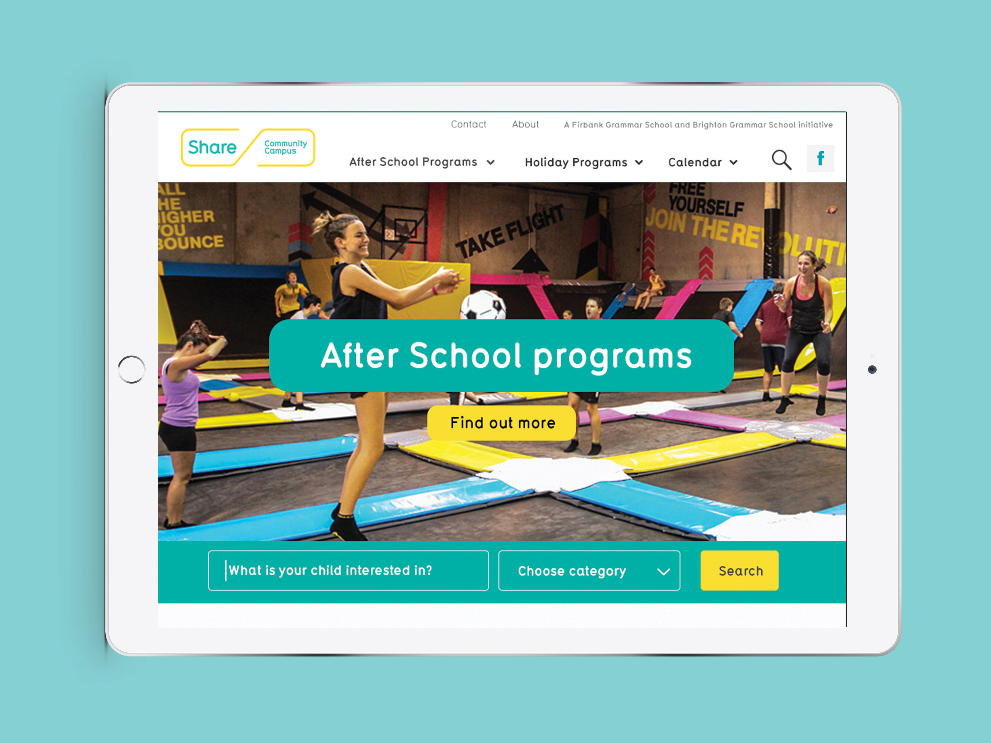
A ground-up refresh was required for Brighton Grammar’s new website. The previous CMS was difficult for staff to use, resulting in stale content that didn’t engage the audience. The site wasn’t optimised for mobile browsing, which was deterring the target audience (parents). Research was undertaken and a UX strategy was developed to use as a reference. The existing copy was redeveloped to suit the fresh and contemporary look and feel. The result is an industry-leading digital solution that has increased enrolments and supports the current BGS community.
Brighton Grammar School Website
A new website from the ground up for Brighton Grammar School.
You may also like

BHP Billiton Environmental report

What makes a good man - Advertising Campaign

Modena Agencies Identity

Share Community Campus Website

Peerless JAL - Environmentally friendly chemicals

Brighton Grammar School Open Day Brochures

Black Honey Skin Care

Good Practice Publication Design

BHP Billiton


Work Hard. Dream Big -- GHPS Mural